
Intranet Design Best Practices
It’s time to refine the design of your new intranet.
We cover best practice considerations,
and what you should keep in mind.

Intranets have now been around since the 1990s. And so, there is a ton of best practice evidence that this guide draws on.
You will find lots more tips and advice on intranet design within our blog. Here we provide an overview of the main issues.
Intranet Information Architecture
Your intranet will contain a vast amount of company information. All the best intranets make sure this information is organized logically, so it is easily accessible.
Intranet information architecture (IA) is critical to success. IA is all about improving the findability and discoverability of the intranet’s content to enhance users’ overall experience.
We start this chapter by looking at best practice trends in IA.
Navigating The Site – Navigation Menu
Site navigation is fundamental to a successful intranet. It dictates how users find data within the site. And your intranet will be a wasted opportunity if employees cannot easily and quickly find the information and tools they need.
Some businesses organize the intranet’s content by team or department. This certainly makes ongoing management and maintenance easier. Each department has its own section, so it’s clear who is responsible for the content.
One disadvantage of this approach is that the section headings are often too broad and indistinguishable. What’s more, if there’s an internal restructuring, then the intranet also has to be reconfigured. This is a time-consuming and labor-intensive process.
As a result, many companies have opted instead for a task-based approach to intranet navigation. Using category labels like ‘How do I…’ or ‘I need to…’ can improve discoverability. However, these can also quickly become unwieldy with big, long descriptions.
Whatever method you use for site navigation, here are the essential things to remember:
- Avoid confusing and unclear category labels.
- Make sure users can navigate without hesitation. Use specific, distinct category descriptions that make it clear what content is included.
- Keep it simple and avoid using jargon or technical language. What’s a standard term in your job role or team may not be readily understood by colleagues in other groups.
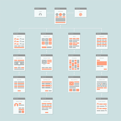
Intranet Site Map
We touched on this briefly in chapter five. A site map identifies the overall structure of your intranet site.
To get started on your site map, gather together a small group of internal stakeholders and a whiteboard. Select a cross-section of employees from different parts of the organization or from the intranet steering group.
The aim here is for the stakeholders to identify the intranet’s essential parent or main pages along with the child or sub-pages.
Let’s use the example of the human resources (HR) department to illustrate how to put together a site map. HR will have a parent page, which will be the gateway to all HR information and data. Child pages might include vacation requests, performance management, wellness initiatives, employee benefits, and so on.
 Follow the same process for other departments and any centralized data that all staff need to access.
And if you are using a topic or task-based approach to site navigation, then stakeholders should identify clear section labels.
The site map has to make sense in the context of the organization. Ideally, it should be possible to navigate the most important information without having to search. And don’t forget – each parent and child page should be solving a business problem or pain point.
Once identified, parent pages are usually presented as mega-menus in the intranet site architecture. These mega-menus, in turn, provide drop-down access to the lower level or child pages.
However, be careful not to overdo the number of child pages. You don’t want your intranet to be like those annoying automated phone systems where you have to select from a series of menus before your issue is resolved. Keep the navigation intuitive and straightforward to avoid a frustrating user experience.
And remember, lots of content will be shared across all teams. Common menus, overarching news items, and CEO messages often have a bonding, unifying effect on the workforce.
Wayfinding
Wayfinding helps users to find their way around the site. Graphic or text clues ensure employees understand where they are on the site and how pages are connected.
For example, wayfinding cues highlight where the user is in the main navigation. Breadcrumbs, as they are called, then identify where the page fits in the intranet information architecture. Furthermore, breadcrumbs can also be used to provide one-click access to higher-level parts of the site.
Quicklinks
Acting as navigational shortcuts, quicklinks provide easy access to popular content and tools. For users, quicklinks are a big time saver. And they are also a useful way to highlight new features and content. Frequently used quicklinks include the following:
 Most viewed
- Hot news
- Most popular forms
- Trending #tags
- Top stories.
Some intranet designers provide customizable quicklinks lists. Employees can personalize their shortcut links to their own preferences and needs.
Page Access
While drawing up your site map, it’s a good idea to consider any appropriate page permission restrictions.
Given the sensitive nature of the intranet information, it’s likely some pages will need to be secure. Page permissions restrict who can create and edit content. And they can also limit access to pages. This means only those employees that need to can view the page. For example, Ben in Marketing should not be able to access private payroll information. Site page permissions can be set by job title, department, or location.
Thinking about these issues at this early planning stage will save you time and hassle further down the line.
Mobile Devices
The standard 9 to 5 office worker is fast becoming a thing of the past. Remote working has exploded since the onset of Covid-19. Furthermore, there are now more flexible ways of working, including freelancers and those in non-desk roles. And so more users than ever are navigating intranets from mobile devices.

In today’s digital workplace, your intranet has to be optimized for mobile devices. Test out the intranet design on smartphones and tablets before going live. And make sure the navigation area fits the screen for both landscape and portrait viewing.
Intranet Pages On-Page Navigation
We tend to read from left to right when scanning information online. Therefore, it’s a good idea to put all the vital information on the left-hand side of the intranet page.
Columns are a great way to present information. However, make sure you use the appropriate column width for the information. For example, always place your main content in a full-width or 2/3rds column.
And less important content such as hyperlinks and social media feeds work well in narrower columns on the right-hand side.
Also, keep in mind how the columns flow on mobile devices, including which display first. Always test it on a mobile device if you can beforehand.
Home Pages Should Pack A Punch
First impressions really do count. The intranet’s home page sets the standard for your whole intranet. And an attention-grabbing home page will draw users in, so make sure yours packs a punch.
Why not use a colorful visual to grab users’ attention. And incorporate your company branding, logo, and fonts, so the intranet is instantly recognizable to employees. While the intranet doesn’t have to be a carbon copy of your public-facing website, it makes sense to have some cross-over.
Regularly refresh the content of the home page. Static, unchanging content is boring and quickly becomes disengaging.
And it’s also a good idea to set up your quick links on the home page to make it easy for the user.
Images And Visual Appeal
A text-heavy intranet makes for a dull and uninspiring user experience.
Diagrams, photos, images, infographics are all useful ways to add visual appeal to your site. Try to avoid using pictures sourced from the web. Instead, include real photos of workers or situations and settings relevant to your employees. As well as increasing their sense of engagement, it will also ensure the intranet is more relevant.
The Six, Six Rule
Too many intranet pages and you run the risk of the site become overly complex. Not only will the intranet be cumbersome to use, but it will also be challenging to navigate.
Try and design the intranet with the six, six rule in mind: a maximum of six pages with six items of content on each page. Following this rule also helps you focus on what’s really important.
And it should be obvious what the problems or pain points are that each page is resolving. If it’s not readily apparent, then you probably need to head back to first base.
White Space
Try to include white space in your design to break up the text and present a minimalist look.
Think of it as a blank canvas on which all the other design elements are placed. Far from being wasted space, white space presents a clean, uncluttered feel to the intranet.
Hyperlinks
Best practice suggests you should be economical with hyperlinks to documents.
Too many hyperlinks on one page can be distracting for the user. Instead, think about breaking the links up into logical sections using expanding and collapsing content areas with specific sub-headings.
Here’s an example: sub-heading Travel Policies > Hotel Expenses (hyperlink). And make sure you mix things up. Instead of always using text hyperlinks (for example, click here), think about using images that act as links. This is often more obvious to the user and makes for a more engaging employee experience.
Specific Headings Produce Meaningful Search Results
 Page, section, and content headings need to be specific and relevant. It’s a balancing act between providing sufficient detail to return meaningful search results and keeping it short enough for scan reading. All navigation categories should be logical and unambiguous.
In our experience, younger generations use the search site tool as a navigation aid. Older generations, however, tend to navigate through the pages to find the information they are looking for. And that’s why accurate, descriptive headings are so important.
Consistency
Your content should be consistent in style and presentation, especially fonts and font sizes. Try not to fall into the trap of copying and pasting directly into the intranet without adjusting the font. Otherwise, you will end up with an inconsistent look and feel that will confuse your users while also looking unprofessional. It is well worth the investment of time to make sure the intranet has a consistent presentation.
Banners
Page header images and banners at the top of each page are a great design feature. Visually engaging, they welcome users to the page. And they can also be used to showcase features and tools within the page.
File Sizes For Web And Mobile
 Large files often take a long time to download when accessed via a mobile connection. There’s nothing more annoying than the browser whirring around as it struggles to download a graphic or video. That high-res, glossy sales brochure may not be viable for your sales reps on the road.
Instead, pick a format that works well on both the web and mobiles. JPEGs or PNGs are the best choices. And if you are using lots of videos on your intranet, then upload them first to YouTube. You can then embed the video in an iframe or widget on your intranet. That way, you can be certain users can access the footage, whether working from a desktop or mobile device.
Custom Integrations
The potential for custom integration with other enterprise systems is one of the intranet’s main advantages. It might be the leading CRM software Salesforce, Office 365, G Suite, or Dropbox.
Custom integrations mean employees don’t waste time switching between different platforms and logins. The intranet simplifies access and makes it easier to share data and information across these platforms.
And it’s also possible to embed hyperlinks or iframes directly in the intranet. This is a good option for frequently used sites or external systems that don’t need full integration, such as a time tracking app or cloud payroll system.
Content Contributors
No doubt, you will have several intranet content creators and editors identified across the organization. These contributors may be based on job, department, or location. Whatever the case, develop branding guidelines to ensure that all-important consistency and uniformity to your intranet presentation.
What’s Included In This Intranet Design Guide
Intranet Design Articles

Employee Directory Software: The Intranet Solution
Are you looking for employee directory software? Well, try googling ‘employee directory software’, and you’ll find hundreds of results. And yes, most of them will do what it says on the box and deliver a functioning employee directory. But that’s it – that’s all they...

Company Intranets: Revolutionize Your Business In 2023
Sometimes dismissed as ancient relics, company intranets have come a long way since their first appearance in 1994. Next-generation platforms have reinvented themselves. They provide state-of-the-art collaboration, communication, and knowledge management tools under...
Internal Website: Uses, Features And Setup
Many companies spend top dollar on trend-setting customer-facing websites with all the bells and whistles. However, often it’s a different story with their internal versions. If there is one, it’s usually cluttered with outdated content, making it impossible to...